User Tools

Site Tools


other:report3d:documentation:report3d_item_editor

Report3D Item Editor

Introduction

The content of the Item Editor window will depend on which type of Item you have selected. The Item can be a Text Item, a Table Item, a 2D Graph Item, a Picture Item, a Movie Item, a Rectangle Item, or an Ellipse Item. In general, the Item Editor window allows the user to alter the position, size and appearance of the item and allows the user to add text to the item.

Text Items

Item

Item Type - Tells the user the type of item that they have selected.

Item ID - Tells the user the unique ID code that belongs to the selected item.

Clone - Allows the user to create a second, identical item to the one that they have selected.

Text

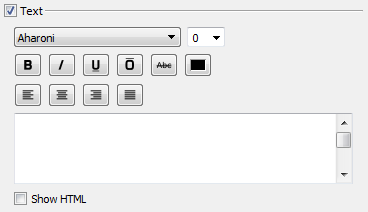
Font - Located on the first row at the left, the Font drop down menu allows the user to select the type of font they want.

Font Size - Located on the first row at the right, the Font Size drop down menu allows the user to select or type in the size of font they want.

Bold Button - First button on the second row, the Bold Button allows the user to bold their selected text.

Italics Button - Second button on the second row, the Italics Button allows the user to italicize their selected text.

Underline Button - Third button on the second row, the Underline Button allows the user to underline their selected text.

Over Line Button - Fourth button on the second row, the Over Line Button allows the user to place a line over their selected text.

Strike Through Button - Fifth button on the second row, the Strike Trough Button allows the user to strike through their selected text.

Colour Button - Sixth button on the second row, the Colour Button allows the user to change the colour of their selected text.

Alignment Buttons - The third row of buttons controls the alignment of the text within the text field.

Text Field - The text field is where the user types the text that they wish to appear within their object.

Show HTML - Checking the Show HTML check box will allow the user to see the HTML code that creates the selected object.

Appearance

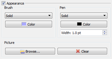
Brush - The drop down menu allows the user to select one of 19 patterns to use as a background in their object. The Colour Button allows the user to select the colour of their background. If the Background type chosen in the drop down menu has a gradient then there will be two colour buttons.

Pen - The drop down menu allows the user to select one of six border patterns. The Colour Button allows the user to select the colour of the border. The width counter allows the user to specify the width of the border in pts.

Picture - The Browse Button allow the user to select a picture to insert into the object as a background. The Clear Button allows the user to remove the picture that they have inserted into the object.

Geometry

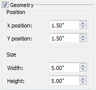
The Geometry section allows you to alter both the position and the size of the object that is selected. The values in the text fields can be changed as follows:

* Using the arrow buttons to the right of the text boxes to increase/decrease the value by 0.01“.
* Placing the cursor in the text box and typing.
* Using the cursor on the report page to drag and alter position or size.

The X position indicates how far, in inches, the top left corner of the object is from the left edge of the report page. The Y position indicates how far, in inches, the top left corner of the object is from the top edge of the report page.

The Width indicates the length of the object, in inches, from left to right. The Height indicates the length of the object, in inches, from the base to the top.

Table Items

Item

Item Type - Tells the user the type of item that they have selected.

Item ID - Tells the user the unique ID code that belongs to the selected item.

Clone - Allows the user to create a second, identical item to the one that they have selected.

Text

Appearance

Geometry

Metric Table

2D Graph Items

Text

Appearance

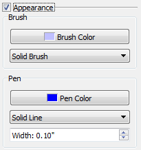
The Appearance section allows users to change the Bursh and Pen.

Geometry

The Geometry section allows you to alter both the position and the size of the object that is selected. The values in the text fields can be changed as follows:

* Using the arrow buttons to the right of the text boxes to increase/decrease the value by 0.01”.
* Placing the cursor in the text box and typing.
* Using the cursor on the report page to drag and alter position or size.

The X position indicates how far, in inches, the top left corner of the object is from the left edge of the report page. The Y position indicates how far, in inches, the top left corner of the object is from the top edge of the report page.

The Width indicates the length of the object, in inches, from left to right. The Height indicates the length of the object, in inches, from the base to the top.

2D Graph

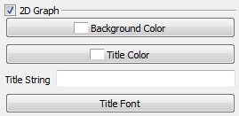
At the top of the 2D Graph section are general settings.

Background Color - Allows you to change the color of the graph's background.

Title Color - Allows you to change the color of the graph's title.

Title String - Allows you to enter a title for your graph. It will appear at the top of the graph in the center.

Title Font - Allows you to change the font of the graph title. This includes: Font (ex. Times New Roman, Arial), Font style (ex. Bold, Italic), Size, Effects ex. (Strikeout, Underline) and Writing System (ex. Latin, Arabic).

Axis

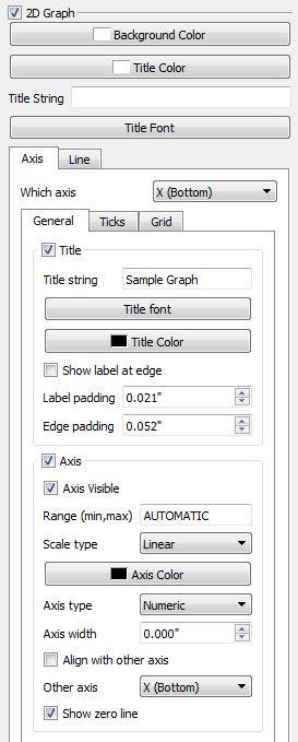
When changing the attributes of the axis you need to specify which axis you wish to alter. This can be done by using the Which Axis drop down menu. The options are: X (bottom), Y (left), X2 (top) or Y2 (right).

General

If you wish to collapse the General Tab into smaller portions you can deselect the check box next to Title or Axis. When you do this the content beneath it will be collapsed until you re-select the check box.

Title string - Allows you to add a title to the axis.

Title font - Allows you to change the font of the axis title. This includes: Font (ex. Times New Roman, Arial), Font style (ex. Bold, Italic), Size, Effects ex. (Strikeout, Underline) and Writing System (ex. Latin, Arabic).

Title Color - Allows you to change the color of the text used for the axis title.

Show label at edge - Automatically changes “Label padding” back to 0.000 inches.

Label padding - Allows you to specify how much space, in inches, you want to have between the title of the axis and the numbers of the axis line.

Edge padding - Allows you to specify how much space, in inches, you want to have between the title of the axis and the edge of the object.

Axis Visible - If checked the axis will be displayed, if unchecked the axis will not be shown on the screen.

Range (min,max) - Allows you to set minimum and maximum values seen on the axis. If you set it to AUTOMATIC the minimum and maximum values of your data set will be used. Otherwise enter you minimum, a comma, then you maximum.

Scale type - Allows you to set the scale of the axis to either Linear or Logarithmic. Note: If you chose to set the Scale to Logarithmic there will be limits to what you can put as the minimum and maximum in the Range section above.

Axis Color - Allows you to change the color of the axis.

Axis type - Allows you to set the axis as either Numeric or String.

Axis width - Allows you to set the axis width, in inches.

Align with other axis - If Align with other axis is selected then the active axis (determined by the drop down menu at the top) will intersect the axis specified with the “Other axis” drop down menu at 0.

Other axis - Specifies which axis will be aligned with the active axis when “Align with other axis” is selected.

Show zero line - If the Show zero line is checked a line will be drawn perpendicular to the axis and intersecting in the axis at 0.
Ticks

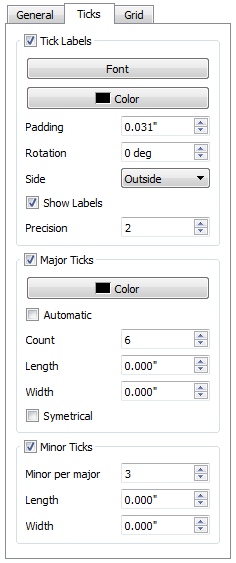
If you wish to collapse the Ticks Tab into smaller portions you can deselect the check box next to Tick Labels, Major Ticks or Minor Ticks. When you do this the content beneath it will be collapsed until you re-select the check box.

Font - Allows you to change the font of the scale on the selected axis. This includes: Font (ex. Times New Roman, Arial), Font style (ex. Bold, Italic), Size, Effects ex. (Strikeout, Underline) and Writing System (ex. Latin, Arabic).

Color - Allows you to change the color of the text used for the axis scale.

Padding - Allows you to specify how much space, in inches, you want between the numbers of the axis and the line of the axis.

Rotation - Allows you to rotate the numbers on the axis up to 90 degrees.

Side - Allows you to put the scale numbers either inside or outside the graph.

Show Labels - If checked the scale numbers will be shown on the axis. If unchecked there will be no numbers shown on the axis.

Precision - Allows you to specify how many places after the decimal point should be shown.

Major Ticks Color - Allows you to change the color of line that links the scale numbers to their position on the axis.

Automatic -

Count - Allows you to specify the number of ticks are shown on the axis.

Length - Allows you to specify the length of the tick that links the scale number to its position on the axis.

Width - Allows you to specify the width of the tick that links the scale number to its position on the axis.

Symmetrical - If the Symmetrical check box is selected then the ticks will extend a distance into the graph which is equal to the distance they extend towards

Minor per major - Allows you to specify how many minor ticks you want to have between each of the major ticks.

Length - Allows you to specify the length of the minor ticks.

Width - Allows you to specify the width of the minor ticks.
Grid

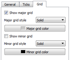
Show major grid - If this check box is selected the major grid lines, which coincide with the major ticks from the Ticks tab, will be drawn.

Major grid style - Allows you to set the style of the major grid lines. The options are: Solid, Dashed, or None.

Major grid color - Allows you to set the color of the major grid lines.

Show minor grid - If this check box is selected the minor grid lines, which coincide with the minor ticks from the Ticks tab, will be drawn.

Minor grid style - Allows you to set the style of the minor grid lines. The options are: Solid, Dashed, or None.

Minor grid color - Allows you to set the color of the minor grid lines.

Line

Add


Modify


Remove

Picture Items

Item

Item Type - Tells the user the type of item that they have selected.

Item ID - Tells the user the unique ID code that belongs to the selected item.

Clone - Allows the user to create a second, identical item to the one that they have selected.

Text

Font - Located on the first row at the left, the Font drop down menu allows the user to select the type of font they want.

Font Size - Located on the first row at the right, the Font Size drop down menu allows the user to select or type in the size of font they want.

Bold Button - First button on the second row, the Bold Button allows the user to bold their selected text.

Italics Button - Second button on the second row, the Italics Button allows the user to italicize their selected text.

Underline Button - Third button on the second row, the Underline Button allows the user to underline their selected text.

Over Line Button - Fourth button on the second row, the Over Line Button allows the user to place a line over their selected text.

Strike Through Button - Fifth button on the second row, the Strike Trough Button allows the user to strike through their selected text.

Colour Button - Sixth button on the second row, the Colour Button allows the user to change the colour of their selected text.

Alignment Buttons - The third row of buttons controls the alignment of the text within the text field.

Text Field - The text field is where the user types the text that they wish to appear within their object.

Show HTML - Checking the Show HTML check box will allow the user to see the HTML code that creates the selected object.

Appearance

Geometry

The Geometry section allows you to alter both the position and the size of the object that is selected. The values in the text fields can be changed as follows:

* Using the arrow buttons to the right of the text boxes to increase/decrease the value by 0.01“.
* Placing the cursor in the text box and typing.
* Using the cursor on the report page to drag and alter position or size.

The X position indicates how far, in inches, the top left corner of the object is from the left edge of the report page. The Y position indicates how far, in inches, the top left corner of the object is from the top edge of the report page.

The Width indicates the length of the object, in inches, from left to right. The Height indicates the length of the object, in inches, from the base to the top.

Movie Items

Item

Item Type - Tells the user the type of item that they have selected.

Item ID - Tells the user the unique ID code that belongs to the selected item.

Clone - Allows the user to create a second, identical item to the one that they have selected.

Text

Font - Located on the first row at the left, the Font drop down menu allows the user to select the type of font they want.

Font Size - Located on the first row at the right, the Font Size drop down menu allows the user to select or type in the size of font they want.

Bold Button - First button on the second row, the Bold Button allows the user to bold their selected text.

Italics Button - Second button on the second row, the Italics Button allows the user to italicize their selected text.

Underline Button - Third button on the second row, the Underline Button allows the user to underline their selected text.

Over Line Button - Fourth button on the second row, the Over Line Button allows the user to place a line over their selected text.

Strike Through Button - Fifth button on the second row, the Strike Trough Button allows the user to strike through their selected text.

Colour Button - Sixth button on the second row, the Colour Button allows the user to change the colour of their selected text.

Alignment Buttons - The third row of buttons controls the alignment of the text within the text field.

Text Field - The text field is where the user types the text that they wish to appear within their object.

Show HTML - Checking the Show HTML check box will allow the user to see the HTML code that creates the selected object.

Appearance

Brush - The drop down menu allows the user to select one of 19 patterns to use as a background in their object. The Colour Button allows the user to select the colour of their background. If the Background type chosen in the drop down menu has a gradient then there will be two colour buttons.

Pen - The drop down menu allows the user to select one of six border patterns. The Colour Button allows the user to select the colour of the border. The width counter allows the user to specify the width of the border in pts.

Picture - The Browse Button allow the user to select a picture to insert into the object as a background. The Clear Button allows the user to remove the picture that they have inserted into the object.

Geometry

The Geometry section allows you to alter both the position and the size of the object that is selected. The values in the text fields can be changed as follows:

* Using the arrow buttons to the right of the text boxes to increase/decrease the value by 0.01”.
* Placing the cursor in the text box and typing.
* Using the cursor on the report page to drag and alter position or size.

The X position indicates how far, in inches, the top left corner of the object is from the left edge of the report page. The Y position indicates how far, in inches, the top left corner of the object is from the top edge of the report page.

The Width indicates the length of the object, in inches, from left to right. The Height indicates the length of the object, in inches, from the base to the top.

Rectangle Items

Item

Item Type - Tells the user the type of item that they have selected.

Item ID - Tells the user the unique ID code that belongs to the selected item.

Clone - Allows the user to create a second, identical item to the one that they have selected.

Text

Font - Located on the first row at the left, the Font drop down menu allows the user to select the type of font they want.

Font Size - Located on the first row at the right, the Font Size drop down menu allows the user to select or type in the size of font they want.

Bold Button - First button on the second row, the Bold Button allows the user to bold their selected text.

Italics Button - Second button on the second row, the Italics Button allows the user to italicize their selected text.

Underline Button - Third button on the second row, the Underline Button allows the user to underline their selected text.

Over Line Button - Fourth button on the second row, the Over Line Button allows the user to place a line over their selected text.

Strike Through Button - Fifth button on the second row, the Strike Trough Button allows the user to strike through their selected text.

Colour Button - Sixth button on the second row, the Colour Button allows the user to change the colour of their selected text.

Alignment Buttons - The third row of buttons controls the alignment of the text within the text field.

Text Field - The text field is where the user types the text that they wish to appear within their object.

Show HTML - Checking the Show HTML check box will allow the user to see the HTML code that creates the selected object.

Appearance

Brush - The drop down menu allows the user to select one of 19 patterns to use as a background in their object. The Colour Button allows the user to select the colour of their background. If the Background type chosen in the drop down menu has a gradient then there will be two colour buttons.

Pen - The drop down menu allows the user to select one of six border patterns. The Colour Button allows the user to select the colour of the border. The width counter allows the user to specify the width of the border in pts.

Picture - The Browse Button allow the user to select a picture to insert into the object as a background. The Clear Button allows the user to remove the picture that they have inserted into the object.

Geometry

The Geometry section allows you to alter both the position and the size of the object that is selected. The values in the text fields can be changed as follows:

* Using the arrow buttons to the right of the text boxes to increase/decrease the value by 0.01“.
* Placing the cursor in the text box and typing.
* Using the cursor on the report page to drag and alter position or size.

The X position indicates how far, in inches, the top left corner of the object is from the left edge of the report page. The Y position indicates how far, in inches, the top left corner of the object is from the top edge of the report page.

The Width indicates the length of the object, in inches, from left to right. The Height indicates the length of the object, in inches, from the base to the top.

Ellipse Items

Item

Item Type - Tells the user the type of item that they have selected.

Item ID - Tells the user the unique ID code that belongs to the selected item.

Clone - Allows the user to create a second, identical item to the one that they have selected.

Text

Font - Located on the first row at the left, the Font drop down menu allows the user to select the type of font they want.

Font Size - Located on the first row at the right, the Font Size drop down menu allows the user to select or type in the size of font they want.

Bold Button - First button on the second row, the Bold Button allows the user to bold their selected text.

Italics Button - Second button on the second row, the Italics Button allows the user to italicize their selected text.

Underline Button - Third button on the second row, the Underline Button allows the user to underline their selected text.

Over Line Button - Fourth button on the second row, the Over Line Button allows the user to place a line over their selected text.

Strike Through Button - Fifth button on the second row, the Strike Trough Button allows the user to strike through their selected text.

Colour Button - Sixth button on the second row, the Colour Button allows the user to change the colour of their selected text.

Alignment Buttons - The third row of buttons controls the alignment of the text within the text field.

Text Field - The text field is where the user types the text that they wish to appear within their object.

Show HTML - Checking the Show HTML check box will allow the user to see the HTML code that creates the selected object.

Appearance

Brush - The drop down menu allows the user to select one of 19 patterns to use as a background in their object. The Colour Button allows the user to select the colour of their background. If the Background type chosen in the drop down menu has a gradient then there will be two colour buttons.

Pen - The drop down menu allows the user to select one of six border patterns. The Colour Button allows the user to select the colour of the border. The width counter allows the user to specify the width of the border in pts.

Picture - The Browse Button allow the user to select a picture to insert into the object as a background. The Clear Button allows the user to remove the picture that they have inserted into the object.

Geometry

The Geometry section allows you to alter both the position and the size of the object that is selected. The values in the text fields can be changed as follows:

* Using the arrow buttons to the right of the text boxes to increase/decrease the value by 0.01”.
* Placing the cursor in the text box and typing.
* Using the cursor on the report page to drag and alter position or size.

The X position indicates how far, in inches, the top left corner of the object is from the left edge of the report page. The Y position indicates how far, in inches, the top left corner of the object is from the top edge of the report page.

The Width indicates the length of the object, in inches, from left to right. The Height indicates the length of the object, in inches, from the base to the top.
other/report3d/documentation/report3d_item_editor.txt · Last modified: 2024/07/17 11:44 by sgranger