Table of Contents
Analyse Page
Sift's Analyse page is the go to for creating meaningful analysis on your data. This page holds a group and workspace widget, which follows from the Explore Page.
There are 2 main widgets within the Analyse page: the PCA widget and the SPM widget. Both of these pages allow you to do different analysis on your data: PCA is used to decompose your data into a lower-dimensional version of your data, and extract meaning about how the variance occurs within the data, while SPM is used to apply statistical tests across the entirety of your data, instead of relying on their application on summary statistics.
For more information about how PCA and SPM work, and when they should be used, see their respective wiki pages:
Both of these analytical tools can be launched from the top toolbar, which opens the ![]() PCA Dialog and
PCA Dialog and ![]() GLM Dialog.
GLM Dialog.
Principal Component Analysis
The PCA page consists of 6 sub-pages related to PCA: Variance Explained, Loading Vector, Workspace Scores, Group Scores, Extreme Plot and PC Reconstruction, which are located on the bottom of the page. Each of these pages provides unique analysis into a section of PCA. Many aspects of each display are customizable, with the user able to specify line styles, colours, and axis labels among other display features.
Once you have completed a PCA analysis on some of your data, you can select that instance from the top menu labeled “PCA Results” on all of the PCA sub-pages.
Variance Explained
The Variance Explained page contains a bar for each principal component (PC) that was calculated. The line along the back of the graph shows the cumulative amount of variance explained. The total variance explained by all of the calculated PCs is written in the top left corner of the graph.
Hovering over a bar causes the percentage explained by that specific PC to be displayed on top of the bar. Hovering over the points on the cumulative amount line causes the PC number, the variance explained by that PC and cumulative variance explained to appear beside the point.
Loading Vector
The Loading Vector page shows the shape of the variance explained for the selected PC at each point during the plotted cycle (also called the eigenvector). This helps the user to understand if certain PCs are associated with the variance at specific portions of the gait cycle.
The user can choose to flip the graph along the y-axis.
Workspace Scores
The Workspace Scores page produces a scatter plot of subject scores for two selected PCs. The subject score for a selected PC is the distance between the subject's score for the PC and the mean score for that PC. This scatter plot approach can help users to visualize whether specific subjects appear to cluster together in the PC representation space.
Clicking on a subject's scatter plot point will cause the point's group and CMZ file names to appear while simultaneously highlighting the associated signal in the Queried Data window.
The user can choose to plot the subjects' normalized scores instead of their raw scores.
Group Scores
The Group Scores display shows the group scores for each PC. The group mean score for each PC is plotted as a point in that group's colour and the standard error is illustrated via error bars.
Hovering over an individual scatter point shows the underlying details for that point.
Extreme Plot
The curves in the Extreme Plot display show the shape and magnitudes of the selected PC at specified intervals from the average. Within the Extreme Plot display, users can select among many different plot types:
- Mean +/- 1 SD Reconstruction: Shows the mean signal, as well as the reconstructed waveforms at +/- 1 standard deviation for that PC. The reconstructed wave forms are computed by multiplying the Loading Vector for that PC by +/- 1 standard deviation, and adding that to the mean signal.
- Mean +/- 5th and 95th percentile Reconstruction: Shows the mean signal, as well as the 5th and 95th percentiles of the reconstructed signal for that PC.
- Mean +/- 5th and 95th percentile raw data: Shows the mean signal, as well as the 5th and 95th percentiles of the raw data for the PC.
- Mean +/- custom percent reconstruction: Shows the mean signal, as well as reconstructed data for the inputted percentiles.
- Mean +/- custom workspaces: Shows the mean signal, as well as the workspace mean signal for 2 workspaces.
- Mean +/- custom value reconstruction: Shows the mean signal, as well as reconstructed data for the inputted scaling factors.
- Mean +/- Slider: This option animates each PC from -2 standard deviations to +2 standard deviations while showing the mean curve. The animation starts when the user clicks Play in the bottom right corner.
Some of the plot types allow the user to input additional specifications. In these cases, the Refresh Plot allows the user to apply their settings to the plot and have it update.
PC Reconstruction
The PC Reconstruction display shows the user what the selected groups'/subjects' underlying data would look like if it were reconstructed from the selected principal components.
- Notice that the coloring here was done by workspace, and not group, as in the previous sub-pages.
Context Menu
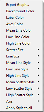
The graphs for each of the PC displays can be customized to the user's specifications. Right-clicking on any of the graphs will bring up a context menu that allows a number of options to be set. Not all options are available for all displays. The context menu for each PCA graph is relatively similar to those from the Explore Page, with some additions:
Export Graph
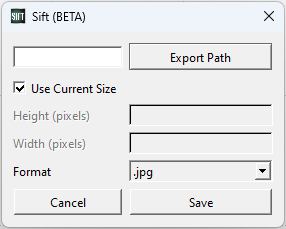
This option allows the user to export the graph as a .jpg. The user controls the file that the graph is saved in and the name of the .jpg with the Export Path button. The Use Current Size check box will save the image as the same size it is in the program. If the check box is unchecked the height and the width of the image can be specified in pixels. The Cancel button will close the dialogue box without and further action. The Save button will create the .jpg file.
Colors
Background Color
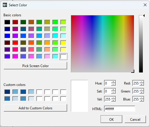
This option allows the user to change the color of the background. When it is selected the Select Color dialog box, presented on the right will appear.
Label Color
This option allows the user to change the color of the labels on the graph. When it is selected the Select Color dialog box, presented on the right will appear.
Axes Color
This option allows the user to change the color of the axis on the graph. When it is selected the Select Color dialog box, presented on the right, will appear.
Axes
Axis
Depending on the graph being manipulated, there will be differences in the sub menu. The sub-menu items may be:
None Selecting this option will remove the labels from the x- and y-axis.

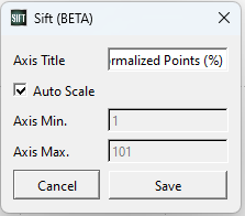
X-Axis Edit … This option opens the X-Axis dialogue box which allows the user to manually entered an Axis Title, an Axis Minimum, and an Axis Maximum. The Cancel button will close the dialogue box without making any changes. The Save button will apply the changes to the graph. Y-Axis Edit …This option opens the Y-Axis dialogue box which allows the user to manually entered an Axis Title, an Axis Minimum, and an Axis Maximum. The Cancel button will close the dialogue box without making any changes. The Save button will apply the changes to the graph. Automatic Re-scale This option brings the graph back to its automatic scaling in the event that the user has zoomed in or out. The same effect can be accomplished by holding down control and shift and left clicking on the graph. Font… This option allows the user to set the Font, Font style, Size, and Effects of the labels.
Labels
Selection Label This option allows the user to manipulate the x and y-axis.
None This option removes the labels from the x and y-axis. Font… This option opens a standard font dialogue box. This allows the user to change the font, font style, size, effects including strikeout and underline and writing system.
Lines
Line Size This option allows the user to control the size of the lines on the graph. The options range from 1 to 6.
Line Color This option controls the color of the line graphed. When it is selected the Select Color dialog box, presented above, will appear.
Line Type This option controls the type of line used. The options are None, Dotted and Line.
Selected Line Size This option controls the width of the selected line. The options range from 1 to 6.
Original Line Type This option controls the type of line used for the original data points. The options are None, Dotted and Line.
Reconstruction Line Type This option controls the type of line used when using PCs to reconstruct the data. The options are None, Dotted and Line.
Mean Line Color This option controls the color of the line for the mean points of the data for the PC being graphed. When it is selected the Select Color dialogue box, presented above, will appear.
Low Line Color This option controls the color of the line for the low points of the data for the PC being graphed. When it is selected the Select Color dialogue box, presented above, will appear.
High Line Color This option controls the color of the line for the high points of the data for the PC being graphed. When it is selected the Select Color dialogue box, presented above, will appear.
Mean Line Type This option controls the type of line used for the mean points of the data for the PC being graphed. The options are None, Dotted and Line.
Low Line Type This option controls the type of the line used for the low points of the data for the PC being graphed. The options are None, Dotted and Line.
High Line Type This option controls the type of the line used for the high points of the PC being graphed. The options are None, Dotted and Line.
Scatter Plots
Scatter size This option allows the user to change the size of the points for all scatter plots.
Selected Scatter Size This option determines the point size of the selected scatter plot only.
Scatter Style This option allows the user to control the shape of points for all scatter plots. The options are None, Dot, Cross, Circle, Disc, Square, Diamond, and Star.
Selected Scatter Style This option determines the point shape of the selected scatter plot only.
Original Scatter Style This option controls the style of the scatter plots used for the original data points. The options are None, Dot, Cross, Circle, Disk, Square, Diamond, and Star.
Reconstruction Scatter Style This option controls the style of the scatter plots used when using PCs to reconstruct the data. The options are None, Dot, Cross, Circle, Disk, Square, Diamond, and Star.
Mean Scatter Style This option controls the shape of the scatter plot for the mean points of the data for the PC being graphed.
Low Scatter Style This option controls the shape of the scatter plot for the low points of the data for the PC being graphed.
High Scatter Style This option controls the shape of the scatter plot for the high points of the data for the PC being graphed.
Bar Charts
Bar Color This option allows the user to change the color of the percentage bar. When it is selected the Select Color dialog box, presented above, will appear.
Bar Size This option allows the user to change the width of the percentage bar. The options range from size 0.1 to 0.9.
Error Bars
Error Bar Color This option allows the user to change the color of the error bar. When it is selected the Select Color dialog box, presented above, will appear.
Error Bar Size This option allows the user to change the size of the error bar from sizes 1 to 5.
Miscellaneous
Apply style to all This option allows the user to apply whatever style changes have been made to all of the graphs at once.
Statistical Parametric Mapping
The SPM page consists of 2 sub-pages related to SPM: Mapping, and Statistics, which are both located on the bottom of the page. Both of these pages provides insight into the components of SPM. Many aspects of the display are customizable, with the user able to specify line styles, colours (through the Data Options Dialog), and axis labels among other display features.
Once you have defined your GLM (necessary to build an SPM), you can select that instance from the top menu labeled “GLM Results:” on both of the SPM sub-pages. Similarily, once you have defined your SPM (as a part of a GLM), you can select that instance from the top menu labeled “SPM Results:” on both of the SPM sub-pages.
Mapping
Control
The info section of the mapping sub-page is empty if there is no selected GLM. When a GLM has been calculated and is selected, it is populated with the type of grouping done on the GLM (either by group or workspace), as well as the list of what is involved in the grouping (i.e. either the groups or workspaces).
Below the info section there is a create GLM button. This button opens the create GLM dialog, prompting you to define and create a new GLM.
Visualizations
There are 2 visualizations on the mapping sub-page: the regression matrix B and the residual matrix e.
Regression Matrix(B): This represents the result of calculating the regression matrix. Currently, these traces will be equivalent to the mean for each group in the GLM, as the experimental design matrix internally represents which grouping each original trace belongs to. The result of the calculated regression matrix will thus be their mean values.
Residual Matrix: This represents the result of calculating the residual matrix. Similarly to the regression matrix, because we are representing groupings with the experimental design matrix, these residuals represent the difference between the traces and their groupings mean value.
Statistics
Control
The threshold controls the p value for which a t threshold is computed. This threshold depends on both the alpha value provided, as well as the “smoothness” of the data within the GLM. Sections above this threshold in the curve can be thought of as “significant”.
The info section of the statistics sub-page is empty if there is no selected SPM. When a SPM has been calculated and is selected, it is populated with the type of test done for the SPM, as well as the groups selected for that test.
Below the info section there is a create SPM button. This button opens the create SPM dialog, prompting you to define and create a new SPM.
Visualization
The visualization shows the selected SPM. On the graph, there are red dotted lines representing the significance threshold (controlled by the threshold value). Any regions of the SPM that are outside of the zone defined by the +/- threshold are significant regions (to the significance alpha), and are shaded in to help display so.
Context Menu
The plots in the SPM sub-pages have a limited context menu, similar to that in the Explore Page. Of note, the options available in this context menu include:
- Axis
- Legend
- Export Graph
- Automatic Re-scale
- Reset Graph


