Sift - Getting Started
| Language: | English • français • italiano • português • español |
|---|
The purpose of this section is to orient new users to Sifts user interface and the general functions available for processing motion capture data. More detailed instructions and details can be found on our documentation and tutorials pages.
This section assumes you have already Installed and activated Sift.
Walk-through
Learn how to load an existing CMZ Library, normalize all signals in the Link Model Based folder, average left and right sides together, then calculate, plot and export the mean data, all done in under five minutes.
- After opening Sift, while on the Load page select Load Library

- Select browse and navigate to and select the folder containing the data you wish to import, then press load.

- After your library has been loaded, ensure that all the expected CMZ's are present (Pressing the + next to the CMZ will expand it to display the individual C3Ds associated)

- On the left of the screen select the Explore tab

- From the explore page select Query Builder

- Press Auto-Populate Queries

- Leave the default values and press create

- Press Calculate All Queries

- Wait for the calculations to finish, note the progress bar on the bottom of the main screen

- When all Queries have been calculated select AnkleAngle_X in the groups display box, this will populate the workspace display box, select all workspaces by clicking the top most workspace and dragging down to the last with the left mouse |button still held down. Then press Refresh Plot

- If the plot displayed is all one color, we need to set the displayed data style to workspace, press Data Styles

- In the Display Styles From... section ensure Workspace is selected the exit the dialog

- Looking at the plot we notice that one trace seems to be out of place

- Left click on the trace to isolate it
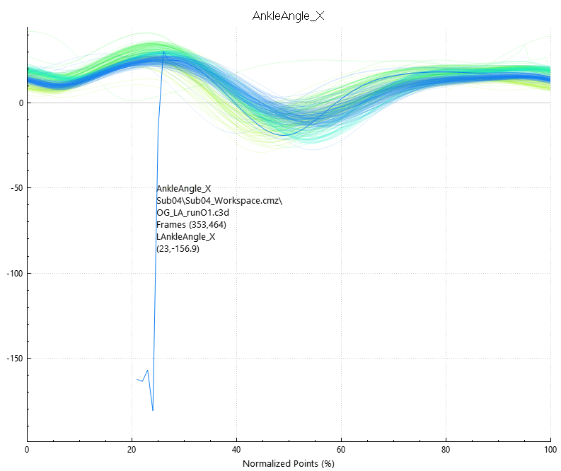
- Then right click and select Exclude -> Exclude Trace (raw data)

- The trace is now excluded from the plot

- We want the workspace mean and dispersion displayed and not the individual traces, so uncheck Plot All Traces, and check Plot Workspace Mean and Plot Workspace Dispersion then press Refresh Plot

- We also want to display the Y and Z dimensions of the ankle angle, so we need some more plots. On the toolbar press |show general options

- Set graph rows to 3 and exit the dialog

- Select the second plot, selecting AnkleAngle_Y and all workspaces then hit Refresh Plot

- Select and exclude the problematic trace

- Uncheck Plot All Traces and check Plot Workspace Mean and Plot Workspace Dispersion

- Select the final plot, selecting AnkleAngle_Z and all workspaces then hit Refresh Plot.

- Select and exclude the problematic trace.

- Uncheck Plot All Traces and check Plot Workspace Mean and Plot Workspace Dispersion

- We now have the graphs plotted and we're ready to export the data: on the toolbar press Export Results

- In the Export Results dialog check Workspace Mean and Workspace Std. Dev. then press generate preview to verify the data

- Select Browse and navigate to the desired export folder, provide a name for the export file and then press export

- Navigate to the selected export folder to ensure the file was exported correctly and inspect the data


Custom Queries
Once your library is loaded, you can define queries to indicate which signals you want to analyze and how you want them grouped (ex. average all right/left sagittal ankle angles for treadmill trials). Data can be grouped based on tags, events, signals or expressions.
Some examples of common groupings are:
- Right & Left signals (e.g., for a control database)
- Grouping that Right Ankle Angle and Affected Left Ankle Angle signals for comparison against Unaffected Left Ankle Angle signals
- Affected/Unaffected
- Grouping signals based on a baseball player's pitching side versus their non-pitching side
This tutorial will teach you how to make a custom query (Ankle Angle X):
- Open the query builder, and press the + next to queries to create a new query

- Name the query Ankle_Angle_X and press save

- Name the first condition L_Ankle_Angle_X and set the type to LINK_MODEL_BASED

- In the Events tab add two left heel strike events to the event sequence by selecting LHS and pressing the right arrow, then press save.

- In the Refinement tab check Refine using tag, and then select a tag, in our case we are selecting RUN. Then press save.

- Now right click on the condition we just made (L_Ankle_Angle_X) and select reflect, this will create the same condition for the Right Ankle, then press Calculate All Queries

- From there you are free to plot your newly calculated query.


Working with Other Plot Types
Sift allows you to work with multiple different plot types in addition to signal time plots, metric values genereated in Visual3D can be view in Sift using bar charts. Sift can also compare signals with other signals as well as metrics with metrics. This section will briefly detail each plot type:
Signal Time
Signal time plots display a continuous data point over time, features include:
- Plotting all traces

- Plotting group mean and dispersion

- Plotting workspace mean and dispersion


Metric
Metric plots display a metric value as a bar chart, features include:
- Plotting all traces

- plotting group mean and dispersion

- plotting workspace mean and dispersion

- Also allowing for choice in the way workspace means are displayed and grouped


Signal Signal
Signal Signal plots compare to signals with each other using a line graph:
- To create a Signal Signal plot you must first create a pair of signal groups, select two signal groups (you can Ctrl click to select multiple groups)
- With both groups selected press New Pair
- Select which group you want on the X-Axis and which you want on the Y
- When the graph is plotted you can also choose which groups styles you want displayed
Metric Metric
Metric Metric plots compare two metric values with each other using a scatter plot.
- To create a Metric Metric plot you must first create a pair of two metric groups, select two metric groups (You can Ctrl click to select multiple groups)
- With both groups selected press New Pair
- Select which group you want on the X_Axis and which you want on the Y
- It is possible that some metric values may overlap, if this is the case you can set the Jitter X or Jitter Y values to displace the scatter plots and make all points visible.