Sift Tutorial: Run K-Means
| Language: | English • français • italiano • português • español |
|---|
The k-means clustering algorithm is a commonly used method for grouping n individual data points into k clusters. It is a multi-variate statistical analysis that reduces the high-dimensional matrix of correlated, time-varying signals into a low-dimensional and statistically uncorrelated set of principal components (PCs). These PCs explain the variance found in the original signals and represent the most important features of the data, e.g., the overall magnitude or the shape of the time series at a particular point in the stride cycle. The value of each particular subject’s score for the individual PCs represents how strongly that feature was present in the data.
The utility of clustering
When analysing biomechanical signals, we often realize that a number of individual traces are similar. It can be useful to describe these traces as belonging to the same group, or cluster. This potentially allows us to simplify our analysis or to pick a single trace as being "representative" of the whole cluster. Because clustering is an unsupervised learning technique, it does not require any specific knowledge or set of training labels from the user. This, in turn, makes clustering useful for data exploration.
Tutorial Overview
This tutorial works off the Principal Component Analysis Tutorial, and assumes a good understanding of using PCA in Sift. This tutorial uses overground walking data from roughly 100 subjects divided into two conditions, normal control and osteoarthritis (moderate to severe). This data set is included in the Demo folder of your Inspect3D installation (e.g., C:\Program Files\Sift\Demo). This is the same data as the PCA Tutorial.
Running a K-Means Test

- Open the
 Outlier Detection Using PCA dropdown on the toolbar.
 - Select K-Means in the dropdown.
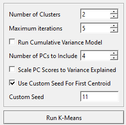
- Change the number of clusters to the correct number for your analysis. This can be an iterative approach, by conducting the K-means analysis multiple times until you are happy with the output. For this example we are going to stick to 2.
- Change the maximum iterations to the number of times you want K-means to iterate. More iterations will give you higher accuracy but at a computational cost. This example will leave it at 5.
- Change the number of PCs to the number of principal components representing the workspace. This will be kept at four.
- Check Use Custom Seed For First Centroid, this will ensure the same centroid is selected each time K-Means is run, allowing for consistency while finding the desired output.
- Set the custom seed, in this case we are setting it to 11.
- Select the Run K-Means button.
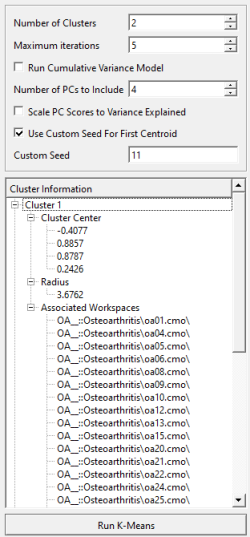
Once K-Means clustering is completed, in the dialog, you will be provided with a list of summary information on each cluster, including cluster center, cluster radius, and the workspaces that get grouped into each cluster.

Viewing K-Means Results

Once you have run your K-Means Test and taken a brief look at the cluster's summary statistics, you want to be able to visualize your clusters.
- Open up the
 Data Options dialog.
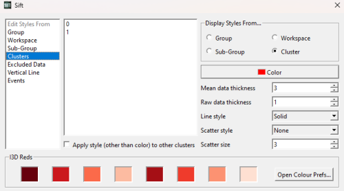
 - In the top right corner under Display Styles From... make sure that Cluster is selected.
- From the Data Options dialog you are also able to change the color or style of each cluster. Select Clusters in the Edit Styles From list on the left and play around with editing the styles of each cluster.
- Navigate to the Analyse page and select the Workspace Scores tab in your PCA results.
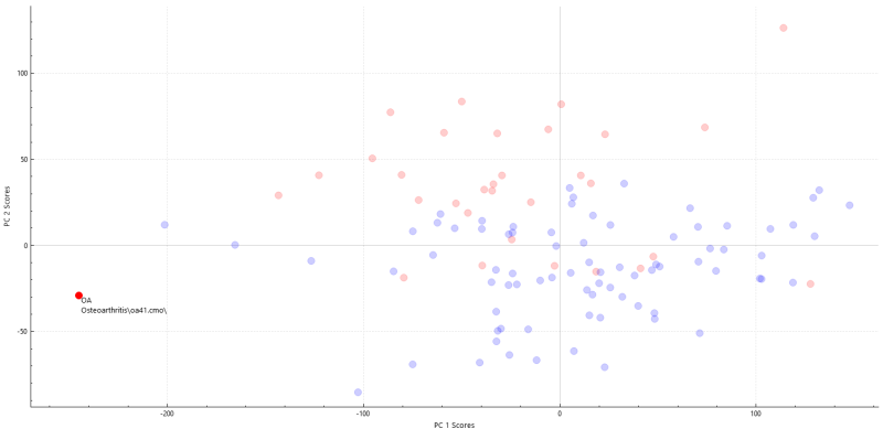
Looking at the workspace tab we can select different points and the group and file will be displayed. This allows us to view which data points in a cluster belong to what group. We can clearly see the data points split into to clusters, blue and red, with somewhat of a separation. red tends to be in the top and blue tends to be in the bottom.
A K-means test finds the similarity between data points and groups them together into clusters. If you had two groups that were vastly different, the clusters would not have mixed groups. If the data points between groups have similarities the clusters may have data points from different groups.
If we look at the results from this K-Means we can see that the clusters are not a perfect representation of each group, signifying that there is some overlap and similarities between groups. The graph on the left shows the groups split up with the osteoarthritis group in purple and the normal group in green. The graph on the right shows the two clusters. If we look at the red cluster it seems to be mainly the osteoarthritis group, and if we look at the blue cluster it seems to be mainly the normal group. The points circled in red show some osteoarthritis datapoints in the second cluster, again indicating some overlap.
Reference
The k-means clustering algorithm is more than 50 years old and is described in almost every textbook on data analysis and machine learning. Sift specifically implements the k-means++ algorithm, which optimizes how the initial cluster centres are chosen.
- Arthur D. and Vassilvitskii S. (2007). k-means++: the advantages of careful seeding. Proceedings of the eighteenth annual ACM-SIAM symposium on discrete algorithms. Society for Industrial and Applied Mathematics Philadelphia, PA, USA. pp. 1027–1035.
- Abstract
- The k-means method is a widely used clustering technique that seeks to minimize the average squared distance between points in the same cluster. Although it offers no accuracy guarantees, its simplicity and speed are very appealing in practice. By augmenting k-means with a simple, randomized seeding technique, we obtain an algorithm that is O(log k)-competitive with the optimal clustering. Experiments show our augmentation improves both the speed and the accuracy of k-means, often quite dramatically.

