Sift - Analyse Page
| Language: | English • français • italiano • português • español |
|---|
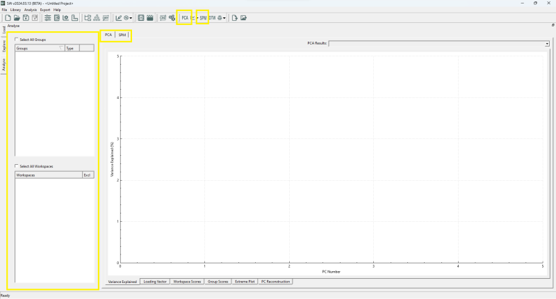
Sift's Analyse page is the go to section to create meaningful analysis on your data. This page holds a group and workspace widget, the same as which is in the Explore Page.
There are 2 main widgets within the Analyse page: the PCA widget and the SPM widget. Both of these pages allow you to do different analysis on your data: PCA is used to decompose your data into a lower-dimensional version of your data, and extract meaning about how to variance occurs within the data, while SPM is used to apply statistical tests across the entirety of your data, instead of relying on their application on summary statistics.
Both of these analytical tools can be launched from the top toolbar, which opens the ![]() PCA Dialog and
PCA Dialog and ![]() GLM Dialog.
GLM Dialog.
How to run?? link...
Principal Component Analysis
The PCA page consists of 6 sub-pages related to PCA: Variance Explained, Loading Vector, Workspace Scores, Group Scores, Extreme Plot and PC Reconstruction, which are located on the bottom of the page. Each of these pages provides unique analysis into a section of PCA. Each of these sub-pages can be dragged to reorder or popped-out into its own standalone window by clicking on the double window icon at the top right of the PCA Graph window. Many aspects of each display are customizable, with the user able to specify line styles, colours, and axis labels among other display features.
Select PCA at the top....
Variance Explained
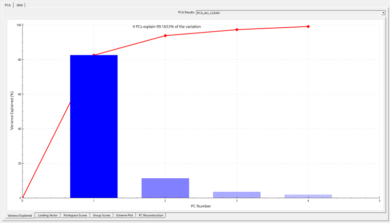
The Variance Explained page contains a bar for each principal component (PC) that was calculated. The line along the back of the graph shows the cumulative amount of variance explained. The total variance explained by all of the calculated PCs is written in the top left corner of the graph.
Hovering over a bar causes the percentage explained by that specific PC to be displayed on top of the bar. Hovering over the points on the cumulative amount line causes the PC number, the variance explained by that PC and cumulative variance explained to appear beside the point.
Loading Vector
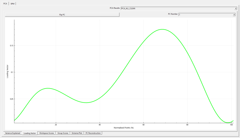
The Loading Vector pageshows the shape of the variance explained for the selected PC at each point during the plotted cycle (also called the eigenvector). This helps the user to understand if certain PCs are associated with the variance at specific portions of the gait cycle.
The user can choose to flip the graph along the y-axis.
Workspace Scores
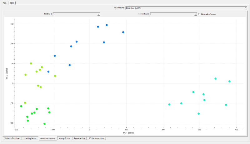
The Workspace Scores page produces a scatter plot of subject scores for two selected PCs. The subject score for a selected PC is the distance between the subject's score for the PC falls and the mean score for that PC. This scatter plot approach can help users to visualize whether specific subjects appear to cluster together in the PC representation space.
Clicking on a subject's scatter plot point will cause the point's group and CMZ file names to appear while simultaneously highlighting the associated signal in the Queried Data window.
The user can choose to plot the subjects' normalized scores instead of their raw scores.
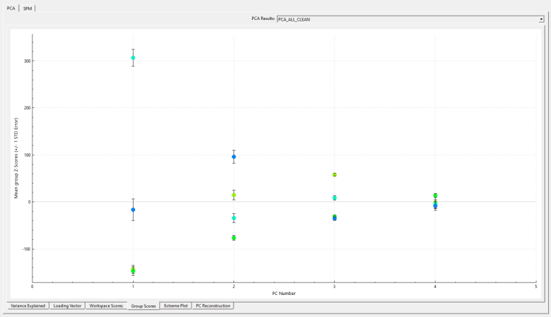
Group Scores
The Group Scores display shows the group scores for each PC. The group mean score for each PC is plotted as a point in that group's colour and the standard error is illustrated via error bars.
Hovering over an individual scatter point shows the underlying details for that point.
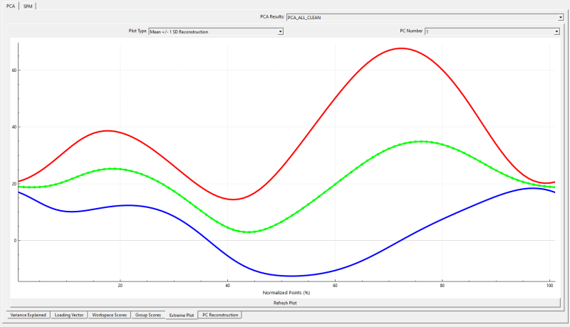
Extreme Plot
The curves in the Extreme Plot display show the shape and magnitudes of the selected PC. Within the Extreme Plot display, users can select among many different plot types.
Mean +/- 1 SD Reconstruction: Shows the mean signal, as well as the reconstructed waveforms at +/- 1 standard deviation for that PC. The reconstructed wave forms are computed by multiplying the Loading Vector by the mean score for that PC.
Mean +/- 5th and 95th percentile Reconstruction: Shows the mean signals, as well as the 5th and 95th percentiles of the reconstructed signal for that PC.
Mean +/- 5th and 95th percentile raw data: Shows the mean as well as the 5th and 95th percentiles of the raw data for the PC.
Mean +/- custom percent reconstruction: Plots the mean as well as reconstructed data for the inputted percentiles.
Mean +/- custom workspaces:
Mean +/- custom value reconstruction:
Mean +/- Slider: This option animates each PC from -2 standard deviations to +2 standard deviations while showing the mean curve. The animation starts when the user clicks Play in the bottom right corner.
Some of the plot types allow the user to input additional specifications. In these cases, the Refresh Plot allows the user to apply their settings to the plot and have it update.
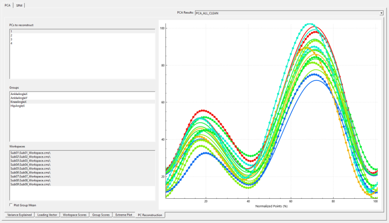
PC Reconstruction
The PC Reconstruction display shows the user what the selected groups'/subjects' underlying data would look like if it were reconstructed from the selected principal components.
Context Menu
...
