Inspect3D PCA Graphs
| Language: | English • français • italiano • português • español |
|---|
Inspect3D has a window with six displays for exploring the results of Principal Component Analysis (PCA). The six displays can be navigated between using the tabs at the bottom of the PCA Graph window. Each display can be dragged to reorder or popped-out into its own standalone window by clicking on the double window icon at the top right of the PCA Graph window. Many aspects of each display are customizable, with the user able to specify line styles, colours, and axis labels among other display features.
Note that these windows will only be populated after PCA is run on the loaded data through the ![]() PCA drop down menu. For a detailed explanation on how to run PCA and a basic explanation of the interpretation see the PCA tutorial.
PCA drop down menu. For a detailed explanation on how to run PCA and a basic explanation of the interpretation see the PCA tutorial.
Displays
The PCA Graphs window has six tabbed displays, each of which provides a unique view of your PCA results.
Variance Explained
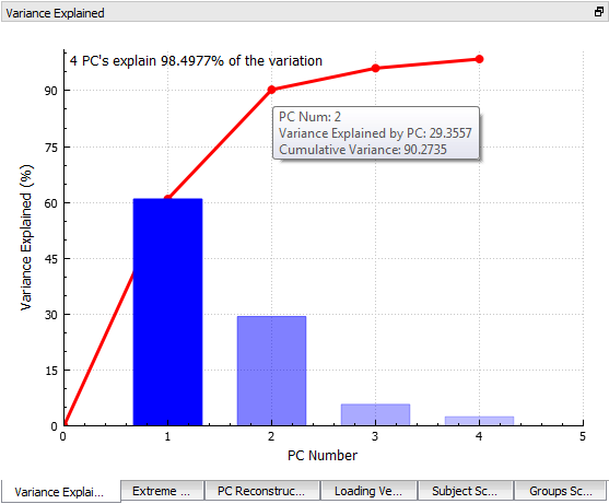
The Variance Explained display contains a bar for each principal component (PC) that was calculated. The line along the back of the graph shows the cumulative amount of variance explained. The total variance explained by all of the calculated PCs is written in the top left corner of the graph.
Hovering over a bar causes the percentage explained by that specific PC to be displayed on top of the bar. Hovering over the points on the cumulative amount line causes the PC number, the variance explained by that PC and cumulative variance explained to appear beside the point.
Loading Vector
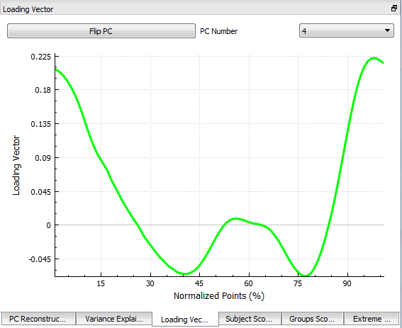
The Loading Vector display shows the shape of the variance explained for the selected PC at each point during the plotted cycle (also called the eigenvector). This helps the user to understand if certain PCs are associated with the variance at specific portions of the gait cycle.
The user can choose to flip the graph along the y-axis.
Workspace Scores
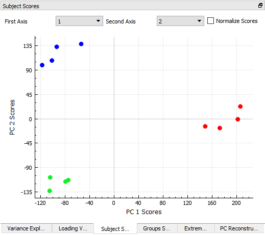
The Workspace Scores subwindow (formerly the Subject Scores subwindow) produces a scatter plot of subject scores for two selected PCs. The subject score for a selected PC is the distance between the subject's score for the PC falls and the mean score for that PC. This scatter plot approach can help users to visualize whether specific subjects appear to cluster together in the PC representation space.
Clicking on a subject's scatter plot point will cause the point's group and CMZ file names to appear while simultaneously highlighting the associated signal in the Queried Data window.
The user can choose to plot the subjects' normalized scores instead of their raw scores.
Group Scores
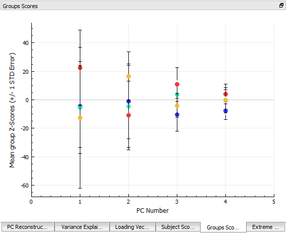
The Group Scores display shows the group scores for each PC. The group mean score for each PC is plotted as a point in that group's colour and the standard error is illustrated via error bars.
Hovering over an individual scatter point shows the underlying details for that point.
Extreme Plot
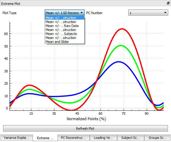
The curves in the Extreme Plot display show the shape and magnitudes of the selected PC. Within the Extreme Plot display, users can select among many different plot types.
- Mean +/- 1 SD Reconstruction: Shows the mean signal, as well as the reconstructed waveforms at +/- 1 standard deviation for that PC. The reconstructed wave forms are computed by multiplying the Loading Vector by the mean score for that PC.
- Mean +/- 5th and 95th percentile: Shows the mean signals, as well as the 5th and 95th percentiles of the reconstructed signal for that PC.
- Mean +/- 5th and 95th percentile raw data: Shows the mean as well as the 5th and 95th percentiles of the raw data for the PC.
- Mean +/- custom percent reconstruction: Plots the mean as well as reconstructed data for the inputted percentiles.
- Mean +/- Slider: This option animates each PC from -2 standard deviations to +2 standard deviations while showing the mean curve. The animation starts when the user clicks Play in the bottom right corner.
Some of the plot types allow the user to input additional specifications. In these cases, the Refresh Plot allows the user to apply their settings to the plot and have it update.
PC Reconstruction
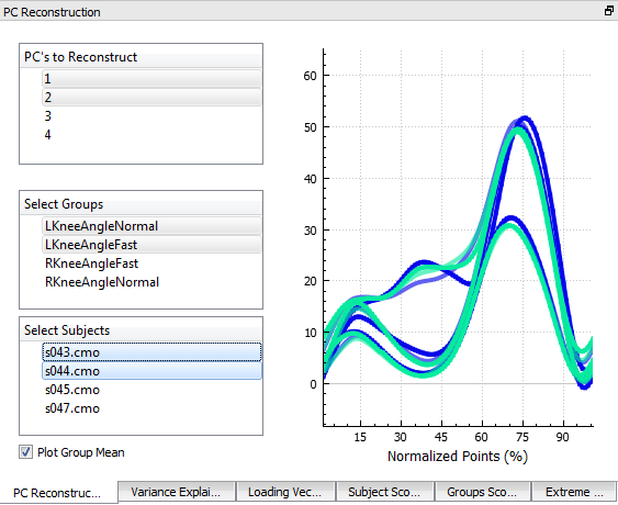
The PC Reconstruction display shows the user what the selected groups'/subjects' underlying data would look like if it were reconstructed from the selected principal components.
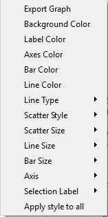
Manipulating Graphs
Axes
Lines
Line Size This option allows the user to control the size of the lines on the graph. The options range from 1 to 6.
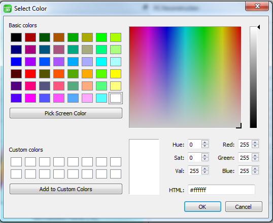
Line Color This option controls the color of the line graphed. When it is selected the Select Color dialog box, presented above, will appear.
Line Type This option controls the type of line used. The options are None, Dotted and Line.
Selected Line Size This option controls the width of the selected line. The options range from 1 to 6.
Original Line Type This option controls the type of line used for the original data points. The options are None, Dotted and Line.
Reconstruction Line Type This option controls the type of line used when using PCs to reconstruct the data. The options are None, Dotted and Line.
Mean Line Color This option controls the color of the line for the mean points of the data for the PC being graphed. When it is selected the Select Color dialogue box, presented above, will appear.
Low Line Color This option controls the color of the line for the low points of the data for the PC being graphed. When it is selected the Select Color dialogue box, presented above, will appear.
High Line Color This option controls the color of the line for the high points of the data for the PC being graphed. When it is selected the Select Color dialogue box, presented above, will appear.
Mean Line Type This option controls the type of line used for the mean points of the data for the PC being graphed. The options are None, Dotted and Line.
Low Line Type This option controls the type of the line used for the low points of the data for the PC being graphed. The options are None, Dotted and Line.
High Line Type This option controls the type of the line used for the high points of the PC being graphed. The options are None, Dotted and Line.
Scatter Plots
Scatter size This option allows the user to change the size of the points for all scatter plots.
- Selected Scatter Size This option determines the point size of the selected scatter plot only.
Scatter Style This option allows the user to control the shape of points for all scatter plots. The options are None, Dot, Cross, Circle, Disc, Square, Diamond, and Star.
- Selected Scatter Style This option determines the point shape of the selected scatter plot only.
Original Scatter Style This option controls the style of the scatter plots used for the original data points. The options are None, Dot, Cross, Circle, Disk, Square, Diamond, and Star.
Reconstruction Scatter Style This option controls the style of the scatter plots used when using PCs to reconstruct the data. The options are None, Dot, Cross, Circle, Disk, Square, Diamond, and Star.
Mean Scatter Style This option controls the shape of the scatter plot for the mean points of the data for the PC being graphed.
Low Scatter Style This option controls the shape of the scatter plot for the low points of the data for the PC being graphed.
High Scatter Style This option controls the shape of the scatter plot for the high points of the data for the PC being graphed.
Bar Charts
Bar Color This option allows the user to change the color of the percentage bar. When it is selected the Select Color dialog box, presented above, will appear.
Bar Size This option allows the user to change the width of the percentage bar. The options range from size 0.1 to 0.9.
Error Bars
Error Bar Color This option allows the user to change the color of the error bar. When it is selected the Select Color dialog box, presented above, will appear.
Error Bar Size This option allows the user to change the size of the error bar from sizes 1 to 5.
Miscellaneous
Apply style to all This option allows the user to apply whatever style changes have been made to all of the graphs at once.
