Inspect3D Tutorial: Perform Principal Component Analysis
| Language: | English • français • italiano • português • español |
|---|
This tutorial will show you how to use Inspect3D in order to perform Principal Component Analysis (PCA) using data from a CMO library. For a full treatment of waveform-based PCA to find differences in waveform data, see the explanation presented in the Research Methods in Biomechanics textbook.
For this tutorial, we will be comparing the the knee flexion angles between participants with osteoarthritis and the normal control group. Our problem is to provide an explanation for differences in knee flexion angles between osteoarthritic walking versus normal walking. We can accomplish this by defining two groups that meet these signal definitions, performing PCA, and interpreting the results.
Data
This tutorial uses overground walking data from roughly 100 subjects divided into two conditions, normal control and osteoarthritis (moderate to severe). This data set is included in Demo folder of your Inspect3D installation (e.g., C:\Program Files\C-Motion\Inspect3D\Demo).
Set the library path to the data directory
As with previous tutorials, we begin by loading the CMO library and defining the queries relevant to our question.
1. Click ![]() Load Library in the toolbar to open the Load Library dialog.
Load Library in the toolbar to open the Load Library dialog.
2. Click Browse and select the folder where the data is stored.
3. Click Load button to import the data.
Define queries and calculate groups
For this tutorial we will manually create two groups based on tags, one for subjects with osteoarthritis and one for normal control subjects. We begin by defining a query for subjects with the OA tag (indicating osteoarthritis).
1. Click on the ![]() Query Definitions icon on the toolbar and then click on
Query Definitions icon on the toolbar and then click on ![]() Query Definitions to open the Query Builder dialog.
Query Definitions to open the Query Builder dialog.
2. ![]() Add a query, name it OA, and click Save.
Add a query, name it OA, and click Save.
3. ![]() Add a condition and name it OA.
Add a condition and name it OA.
3.1. Signals: Set TYPE - DERIVED, FOLDER - PCA, NAME - RKNEE_ANGLE, COMPONENT - X. This is the only signal in the data set.
3.2. Events: There are no events in this data set, so this tab can be skipped.
3.3. Refinements: Check the Refine using tag checkbox and select the OA tag.
3.4. Click Save
Next we will define a query for subjects with the NC tag (indicating Normal Control). In this case we can easily modify our previous query rather than starting from scratch.
1. ![]() Add a query, name it NC, and click Save.
Add a query, name it NC, and click Save.
2. ![]() Add a condition and name it NC.
Add a condition and name it NC.
3. In the Refinements tab, change the selected tag from OA to NC.
4. Click Save.
You can verify here that the new NC group has the same signal and event selections as the OA group. Click Calculate All Queries and then close the Query Builder dialog.
Exploring the data
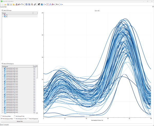
There will now be two Groups in the Queried Data subwindow's Groups list. Selecting either of these will display the associated workspaces in the Workspaces list below. We can verify the queries that we produced in the first section by visualizing our traces.
1. Select all groups and all workspaces.
2. Check only the Plot Workspace Mean checkbox.
3. Click Refresh Plot.
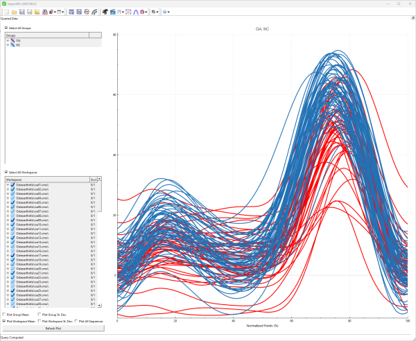
The plot that is produced will not be very informative if the traces are not coloured by group, which is the comparison we are interested in. If this is the case, open the ![]() Show Options dialog from the application tool bar and under Plotting options set the Display Styles from to "Group".
Show Options dialog from the application tool bar and under Plotting options set the Display Styles from to "Group".
Once this is done, inspecting the plot shows that although participants from the two groups walk very differently, obvious when watching them in-person, their knee flexion angles are quite similar. Because the traces overlap significantly between the groups throughout the entire gait cycle, conventional statistics will likely not be useful for describing the differences between these two groups.
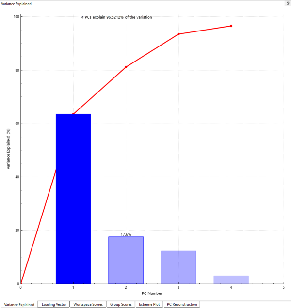
This is one of the motivations behind PCA: by transforming our original data into a coordinate system based on principal components we will end up with a few dimensions that explain most of the variance in the data set. This, in turn, will help us to explain and detect the differences between the groups.
Running Principal Component Analysis
Interpreting PCA results
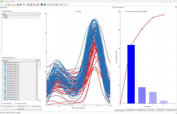
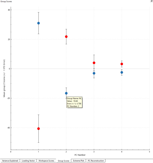
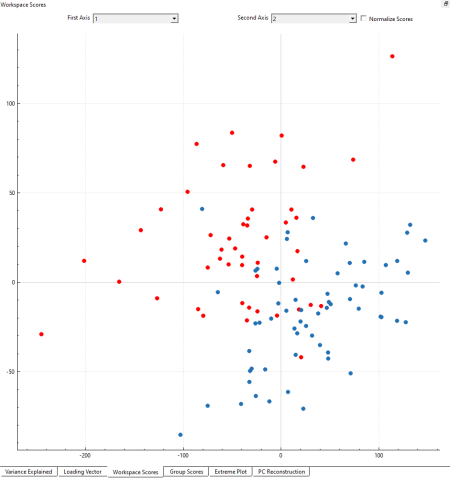
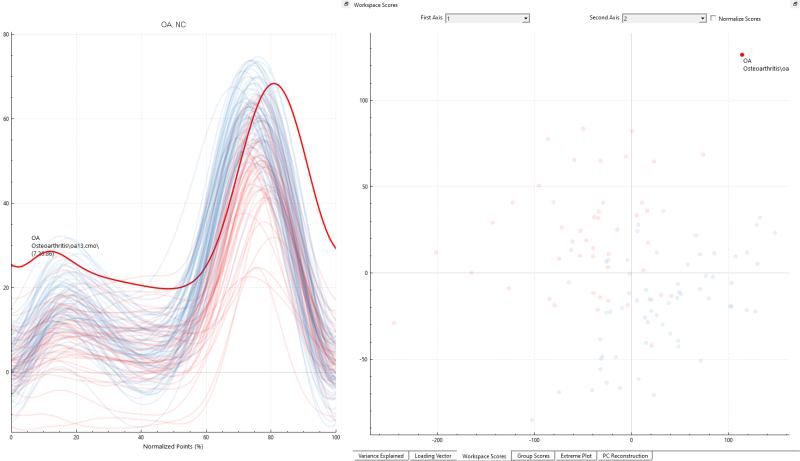
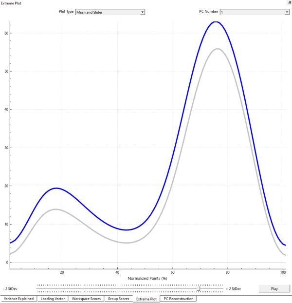
The results from the PCA are described in 6 windows: Variance Explained, Loading Vector, Workspace Scores, Group Scores, Extreme Plot, and PC Reconstruction. We will focus on four specific windows that are enlightening for this tutorial; full descriptions for each window are available here.
