Inspect3D Tutorial: Run K-Means
| Language: | English • français • italiano • português • español |
|---|
Utility of K-Means
When analyzing biomechanical signals, we often realize that a number of individual traces are similar. It can be useful to describe these traces as belonging to the same group, or cluster. This potentially allows us to simplify our analysis or to pick a single trace as being "representative" of the whole cluster. Because clustering is an unsupervised learning technique, it does not require any specific knowledge or set of training labels from the user. This, in turn, makes clustering useful for data exploration. For more information check out the K-means clustering page. This tutorial will showcase how to interpret the results of clustering between a normal group and an osteoarthritis group.
Overview of Tutorial
This tutorial works off the Principal Component Analysis Tutorial, and assumes a good understanding of using PCA in Inspect3D. This tutorial uses overground walking data from roughly 100 subjects divided into two conditions, normal control and osteoarthritis (moderate to severe). This data set is included in the Demo folder of your Inspect3D installation (e.g., C:\Program Files\C-Motion\Inspect3D\Demo). This is the same data as the PCA Tutorial.
Running a K-Means Test
It is assumed the groups are loaded, and a PCA has been completed.
1. Open the ![]() PCA Options dropdown menu on the toolbar.
PCA Options dropdown menu on the toolbar.
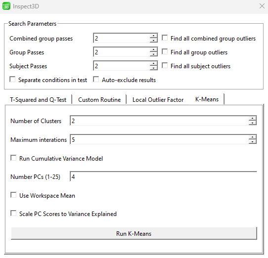
3. A new dialog will display with option of a T-Squared and Q-Test, Custom Routine, Local Outlier Factor and K-Means. Select the K-Means tab.
4. Change the number of clusters to the correct number for your analysis. This can be an iterative approach, by conducting the K-means analysis multiple times until you are happy with the output. For this example we are going to stick to 2.
5. Change the maximum iterations to the number of times you want K-means to iterate. More iterations will give you higher accuracy but at a computational cost. This example will leave it at 5.
6. Change the number of PCs to the number of principal components that represent the workspace. This will be kept at four.
7. Select Use Workspace Mean.
8. Select Run K-Means.
9. Close the ![]() Run QA Using PCA dialog.
Run QA Using PCA dialog.
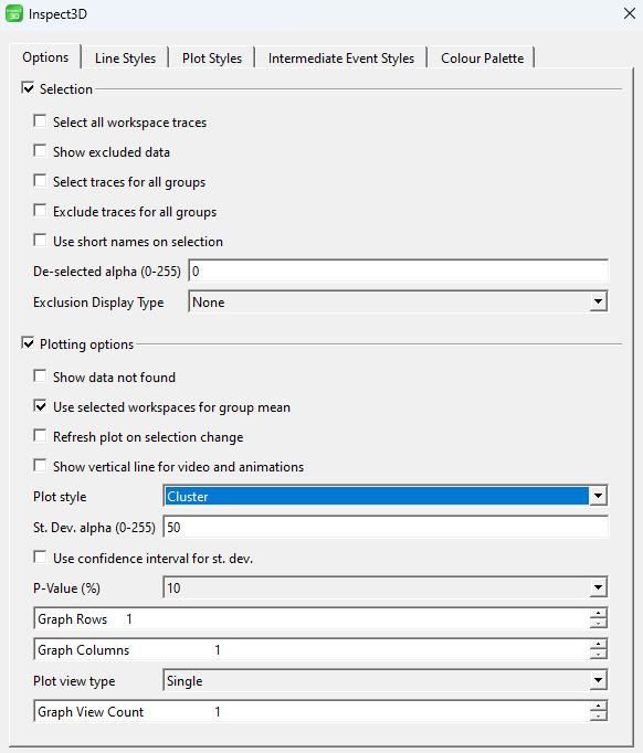
10. Got to the ![]() Show Options dialog and change Plot Style to Cluster. The colors of the clusters are automatically set to the color palette. This can be changed by going to the Colour Palette Tab.
Show Options dialog and change Plot Style to Cluster. The colors of the clusters are automatically set to the color palette. This can be changed by going to the Colour Palette Tab.
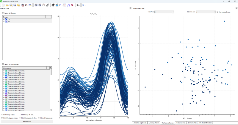
11. Close the ![]() Show Options dialog, and select the Workspace Scores in the PCA results. You should see the clusters of data points.
Show Options dialog, and select the Workspace Scores in the PCA results. You should see the clusters of data points.
Interpreting K-Means Results
The results of the K-means clustering can be seen in the Workspace Scores tab. The queried data should also be updated to reflect the correct clustering.
Note: Results may vary if different parameters were chosen.
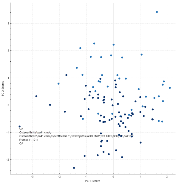
Looking at the workspace tab we can select different points and the group and file will be displayed. This allows us to view which data points in a cluster belong to what group. We can clearly see the data points split into to clusters, light blue and dark blue, with somewhat of a separation. Light blue tends to be in the top right corner and dark blue tends to be in the bottom left.
A K-means test finds the similarity between data points and groups them together into clusters. If you had two groups that were vastly different, the clusters would not have mixed groups. If the data points between groups have similarities the clusters may have data points from different groups.
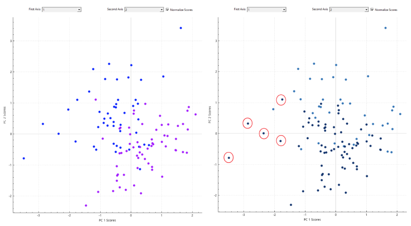
If we look at the results from this K-Means we can see that the clusters are not a perfect representation of each group, signifying that there is some overlap and similarities between groups. The graph on the left shows the groups split up with the osteoarthritis group in purple and the normal group in blue. The graph on the right shows the two clusters. If we look at the light blue cluster it seems to be mainly the osteoarthritis group, and if we look at the dark blue cluster it seems to be mainly the normal group. The points circled in red show some osteoarthritis datapoints in the second cluster, again indicating some overlap.
