Report 2D Graph
| Language: | English • français • italiano • português • español |
|---|
The 2D graph reports allow the user to display any signal in the Workspace against any other signal in the Workspace.
Adding a 2D Report graph
To add a 2D report graph, select 2D Graph in the Items to add combo box and select the Add Button

2D Report Graph Dialog
The following dialog will appear and should be populated.

This dialog has three sections to populate.
Section 1
Graph title, font selection and size. (Visual3D Version 5.0 feature)

Section 2
The basic graph properties

in this example, the graph will be plotted on Page 2, Column 1, Row 1
Files to Graph
- The Files to Graph combo allows the user to select ALL_FILES or any TAG
Line Color and Line Style
- The top Line Color and Line Style refer to the signal lines drawn
Mean and Standard Deviation
- In this example, the check boxes Graph Mean and Graph Standard Deviation are checked, which means that the mean and standard deviation of the signal lines selected will be computed and displayed.
Annotations
See also the associated Pipeline Command Add_Graph_Annotation
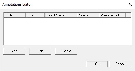
- The initial dialog.
- Select Add to add an annotation to the graph
- Select Edit to modify an existing annotation.

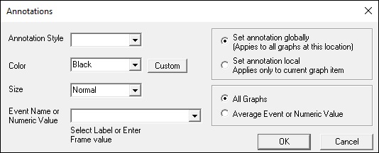
- The initial dialog for the annotation

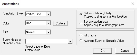
- Select the parameters of the annotation.
- If All Graphs are selected an annotation is added for every occurrence of the Event for every graph.

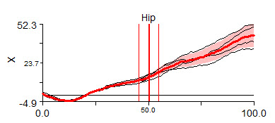
- Notice the multiple vertical lines because there is an event for each graph.

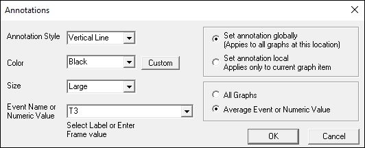
- If Average Event or Numerical Value is selected, Visual3D interprets the edit box.
- For example, specifying the Event label T3

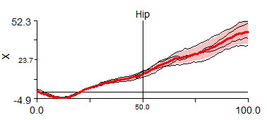
- For example, in this case the average location of the Event is identified and drawn.

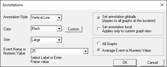
- If Average Event or Numerical Value is selected, Visual3D interprets the edit box.
- For example, specifying the Time 3

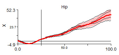
- For example, in this case the annotation is drawn at 25% of the x-axis..

Section 3
The signal used for the x-axis.

In this example, time is displayed on the x-axis.
The signals in the Y-Axis properties for (File to graph and within a graph) that have occurrences of the range Range Begin to Range End will be drawn on the graph.
If Intermediate Events are selected, only ranges from Range Begin to Range End that contain the intermediate events will be graphed.
If Exclude sequences containing is populated, only ranges from Range Begin to Range End that do not contain the excluded events will be graphed
Section 4
The signal used for the y-axis

In this example, the x-component of the Right Ankle Angle will be displayed.
The range of the graph can be specified as:
- Normalize 0% to 100% - each range of data will be scaled from 0 to 100 percent
- Global Min to Max - the minimum and maximum value of the signals across all ranges is computed
- By Explicit Setting - The user can format the graph and specify an explicit range regardless of the signals selected.
Defining an Explicit Range
Select a graph in the report. If the graph is selected you will see "handles"

Move the cursor over the selected graph, and push the right mouse button. A menu will appear.

Select Format Graph and a dialog will appear

Select the Y Min and Y Max values and save these settings as the default. This means that these setting will be preserved in the Report Template.

Section 5
Set the properties of the legend
Move the cursor over the selected graph, and push the right mouse button. A menu will appear.
Select Format Graph and a dialog will appear
Select the option to display the legend.
Select the button to modify the legend

The legend can be placed at the Top Left, Top Right, Bottom Left, or Bottom Right.
1 or more of the selections of the legend text can be selected.
Adding Custom Legend Text
Adding the text for the Report Legend.
![]()
If you have populated this dialog, you will not see the legend in the graph by default.
If you have entered text in the graph format dialog, you need to select the option to display text in the "Legend Properties" dialog.
Adding more signals to the Report Graph
The report dialog acts on one report graph entity.
The graph that appears in the report, however, may contain many entities.
A second signal can be added to the graph in the report by adding another graph entity to the same location. Each graph entity may contain its own graph properties.

For example, this image shows two graphs RANKLE_ANGLE and LANKLE_ANGLE located on Page 2, Column 1, Row 1.
The resulting graph contains data from the 2 signals. RANGLE_ANGLE in Red and LANKLE_ANGLE in Black, each with its own mean and standard deviation.
