Sift - Plot Options Dialog: Difference between revisions
No edit summary |
No edit summary |
||
| Line 6: | Line 6: | ||
The [[File:sift_plot_options.png|30px]] Plot Options Dialog allows | The [[File:sift_plot_options.png|30px]] Plot Options Dialog allows you to customize your how you want to customize your plots in Sift. The dialog can be found in the [[Sift - Toolbar|toolbar]] and under the File menu. | ||
[[File:PlotOptionsButton.png|500px]] | [[File:PlotOptionsButton.png|500px]] | ||
Revision as of 14:04, 26 March 2024
| Language: | English • français • italiano • português • español |
|---|
The ![]() Plot Options Dialog allows you to customize your how you want to customize your plots in Sift. The dialog can be found in the toolbar and under the File menu.
Plot Options Dialog allows you to customize your how you want to customize your plots in Sift. The dialog can be found in the toolbar and under the File menu.
Plot Options Overview
There are four main sections in the plot options dialog.
- Overview of plots: This sections shows all of the current plots in the explore page.
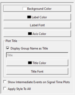
- General Options: This section covers general changes to the plots and changes to the title.
- Y axis Options: All edits to the y axis.
- X axis Options: All edits to the x axis.
Overview of Plots
This section allows for a clear interface on what plot you are currently editing. Each plot shows what its current state is including what is being plotted, and what are the current customizations. The selected plot will have a gray border around it.
General Options

Background Color: Selecting this will open a color dialog that will change the plots background color.
Label Color: Selecting this will open a color dialog that will change the labels (x axis, and axis) color.
Label Font: Selecting this will open a font dialog that will change the font and size of the labels.
Display Group Name as Title: Checking this box will keep the group name as the title. If multiple groups are graphed they will be separated by a comma. If this is not checked you can edit the title in the line edit below.
Title Color: Selecting this will open a color dialog that will change the title's color.
Title Font: Selecting this will open a font dialog that will changed the font and size of the title.
Show Intermediate Events: If checked intermediate event in each traces signal will be graphed on the selected plot. If you are having difficult viewing, make sure your line styles and color for intermediate events are changed in the Data Options Dialog
Apply Style to All: If checked, the styles selected in this section will be applied to all plots.
Y Axis Options

Title: Line edit to change y axis title.
Auto Scale: If checked the y axis will be scaled to the data. If not checked, you will be able to manually select a Minimum and Maximum.
Auto Ticks: If checked the ticks on the y axis will be scaled to the data. If not checked, you will be able to manually select the number of Major Ticks and the number of Minor Per Major ticks.
X Axis Options

Title: Line edit to change x axis title. This is defaulted to Normalized Points (%).
Auto Scale: If checked the x axis will be scaled to the data. If not checked, you will be able to manually select a Minimum and Maximum.
Normalize X Data: If checked the X data will be normalized in correspondence with the query definition.
Auto Ticks: If checked the ticks on the x axis will be scaled to the data. If not checked, you will be able to manually select the number of Major Ticks and the number of Minor Per Major ticks.


